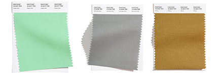
If you love scrolling interior design photos, finding out the latest color trends probably piques your interest as much as it does ours. We enjoy seeing the evolution of color pairings and popular shades over time. When Pantone releases their top colors for the following year, we spend time identifying how those colors can look–as individual accents and combined for a unique statement. We’ve got their top ten, plus an additional five they include that highlights the neutrals we’ll see in the coming year. What have we discovered? This year’s colors offer an unexpected optimism that the world needs right now…
Color Trends Follow Classic Pairings
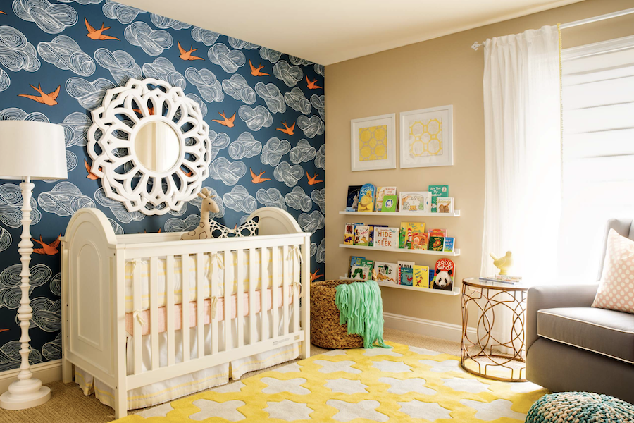
It’s always fun to see how classic pairings change over the years. Blue and orange are one of those duos. This playful nursery is bursting with joy, enlivened with color. It doesn’t stop at that charismatic accent wall, however. The room is filled with energizing hues, brought together for a truly happy space.

Interior Colors Invoke Soothing Calm
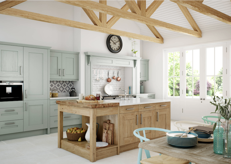
As we have found in 2020, your home should be your sanctuary. While that looks different for everyone, creating spaces that can calm and soothe are very important. Among color trends for the upcoming season, the idea of warming up kitchen spaces with color is on the rise. The kitchen is the heart of the home, and designing it in a way that fills you with happiness is important. One of the latest colors to grace kitchen cabinetry? Greens paired with warm woods.
What’s New with Blue?
There’s always a blue on the color trends palette, whether it’s bright and happy or dark and moody. That’s because blue will always be a staple in home design. After all, Classic Blue was chosen as color of the year for 2020, and 2016 saw a soft blue shade sharing the title with pink. The upcoming year’s trending colors are no different, with two shades of blue in the top ten.

Speaking of Blue
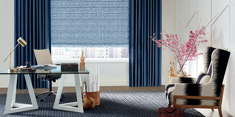
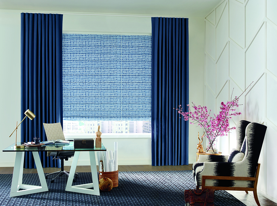
As color trends evolve, so do the ways we choose to style our homes. Some people enjoy contrast–where design elements stand out. Others are drawn to hues from the same color family, just as is the case with the blues in this home office. The patterned roman shades pair with the solid darker blue drapery panels for style, while staying in the same color family. Adding splashes of colors, like the pink stems here, is a great way to mix things up for an instant refresh when you want it.
Hunter Douglas Design Studio® Roman Shades and Drapery Panels

Enjoy Cozy Style
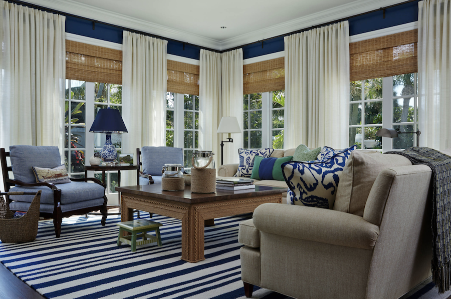
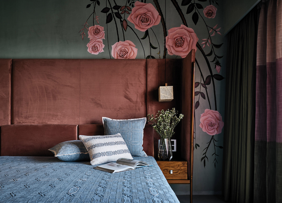
There’s no room that should tell the story of the person who resides there more than a bedroom space. And, this room deserves to exude comfort, calm and beauty. Bringing in textures and fabrics is another way to add style with the resulting comfort. The contrasting blue with coral is a nice touch here, defining the elements of the design.

Always On Your Mind
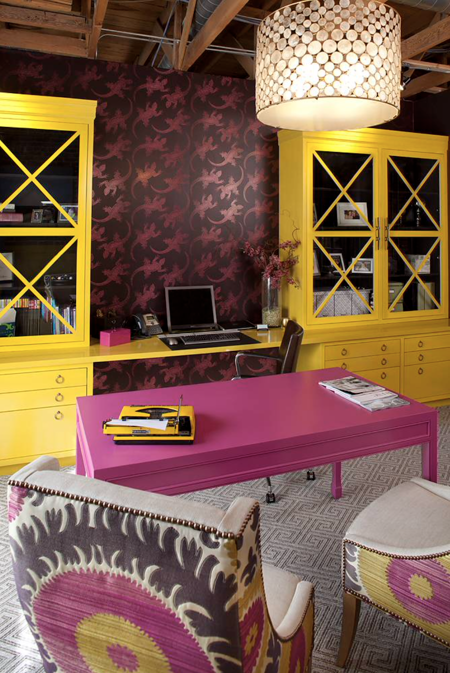
Once a forgotten (or non-existent) space, the home office has been at the forefront of design this year, as everyone has been staying home and working from home as much as possible this year. More than ever, the space where you spend your days should reflect the type of environment that increases productivity, energizes you and makes you feel stable. That looks different for everyone. But, from minimalism to maximalism, and everywhere in between, identify what works for you, and be intentional about creating the right environment.

Did You Discover a New Color?
Have these inspiring photos encouraged you to re-think a space in your home? Do you need to add splashes of color for a refreshed look? No matter what designs speak to you, remember to trust your personal style, making your home all it can be. If you are looking to add the style or function of window treatments, like blinds, shades, shutters or draperies into your home, let us know! We’d love to listen to your plans and ideas so we can guide you to the fabrics and features that will best suit you and your family. Contact our team, at Skyline Window Coverings, today.

