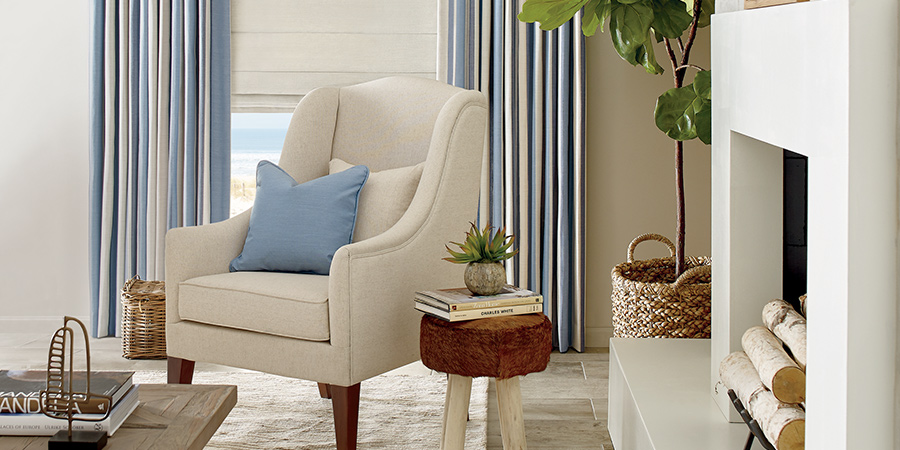
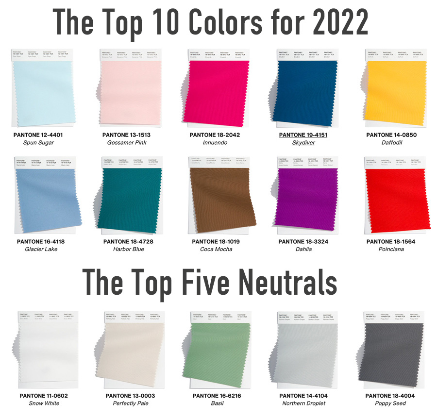
Each year, The Pantone Color Institute releases a palette of ten colors. One of those top ten is ultimately chosen as the next Color of the Year. We are here to introduce you to the upcoming color palette 2022. It’s a showstopper! This palette will be used by interior designers and decorators alike. If you’re thinking of adding color to your home, we’ve got inspo for you! There are ten colors, ranging from soft to bold. There are also five chosen neutrals. Ready to see what’s coming?
Give Classic Pairings a New Look
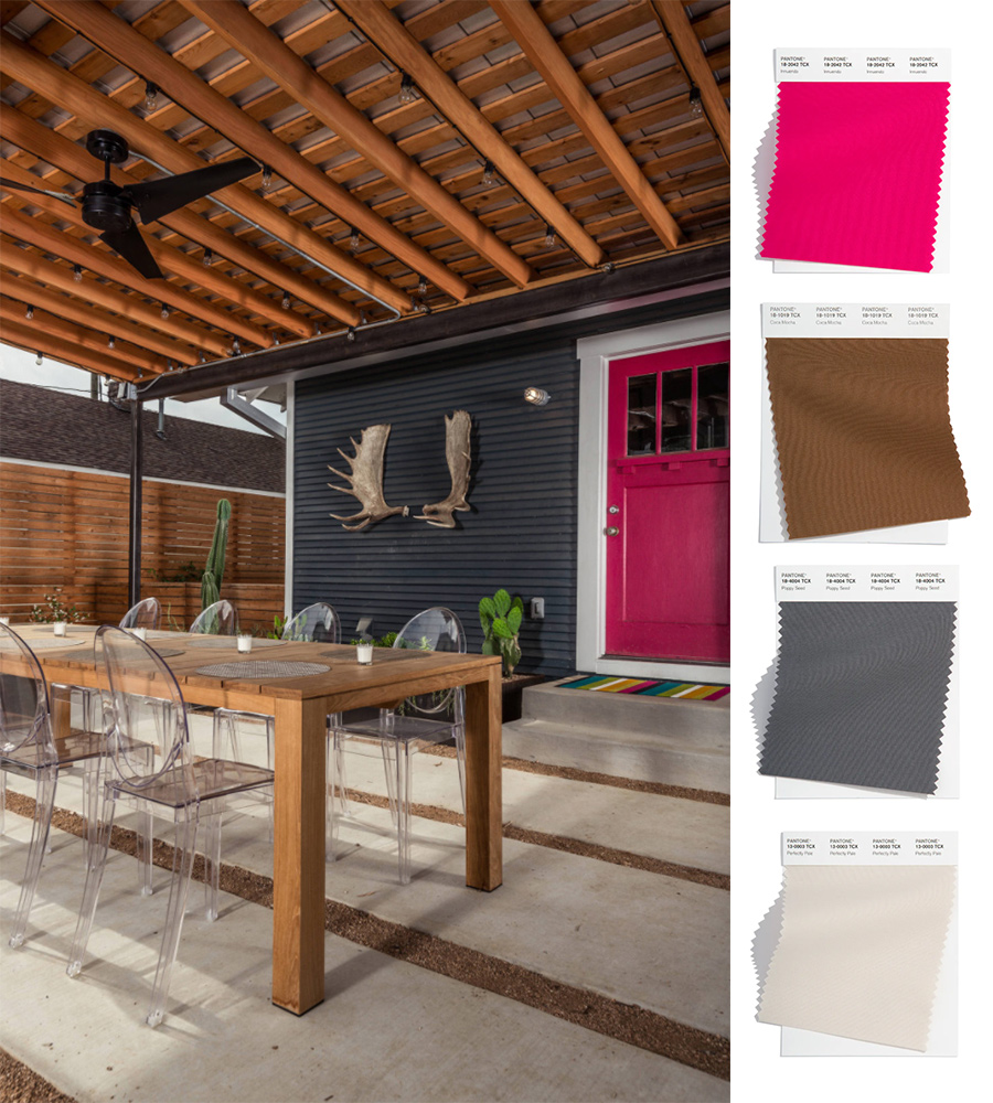
Black, white & red are often used together, and the upcoming color palette 2022 is no exception! Except, this year, that color combo has shifted to bring together a new color trio! While wood tones are often seen in home design, the large amount of stained wood is warming up the pairing of gray and pink.
Experience Soft, Yet Bold
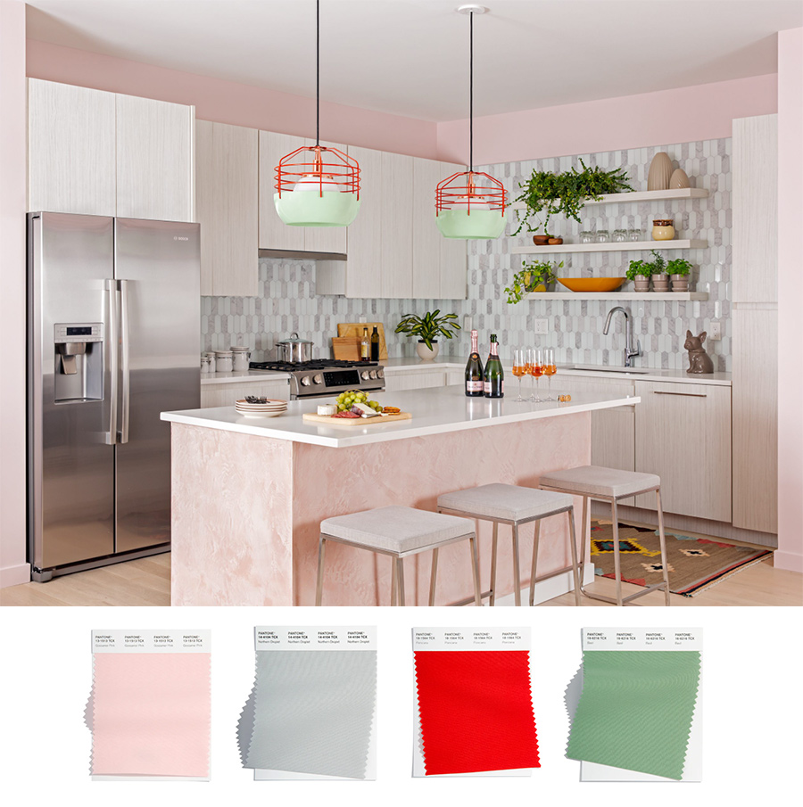
This color collection starts out soft with Gossamer Pink, Northern Droplet, and Basil. Poinciana Red steps in to offer a welcomed bold touch–shaking it all up. The neutrals help to ground the space and instill a calm feeling, while the red adds the fun pop of color to the space. We’re thinking color combinations like this, subtle with a hint of bold, are sticking around for awhile!
Highlight Stunning Neutrals
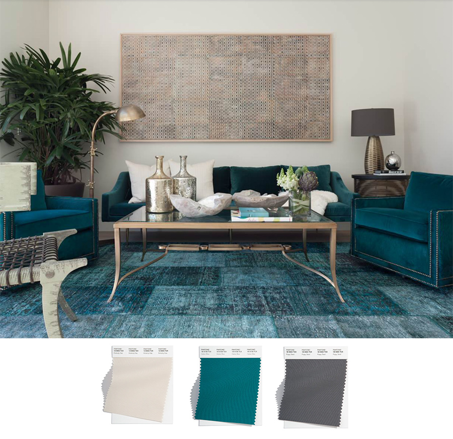
A trend we’re seeing a lot of is adding a brighter tone amongst some basic neutrals. Neutral colors are never going away in the design world, and they’re always a great place to start with a color palette! Once locking down your beautiful neutrals, finding a stunning color to pair with it can be such a fun process. Just look at how amazing Harbor Blue looks paired with Perfectly Pale and Poppy Seed.
Stay Calm & Serene
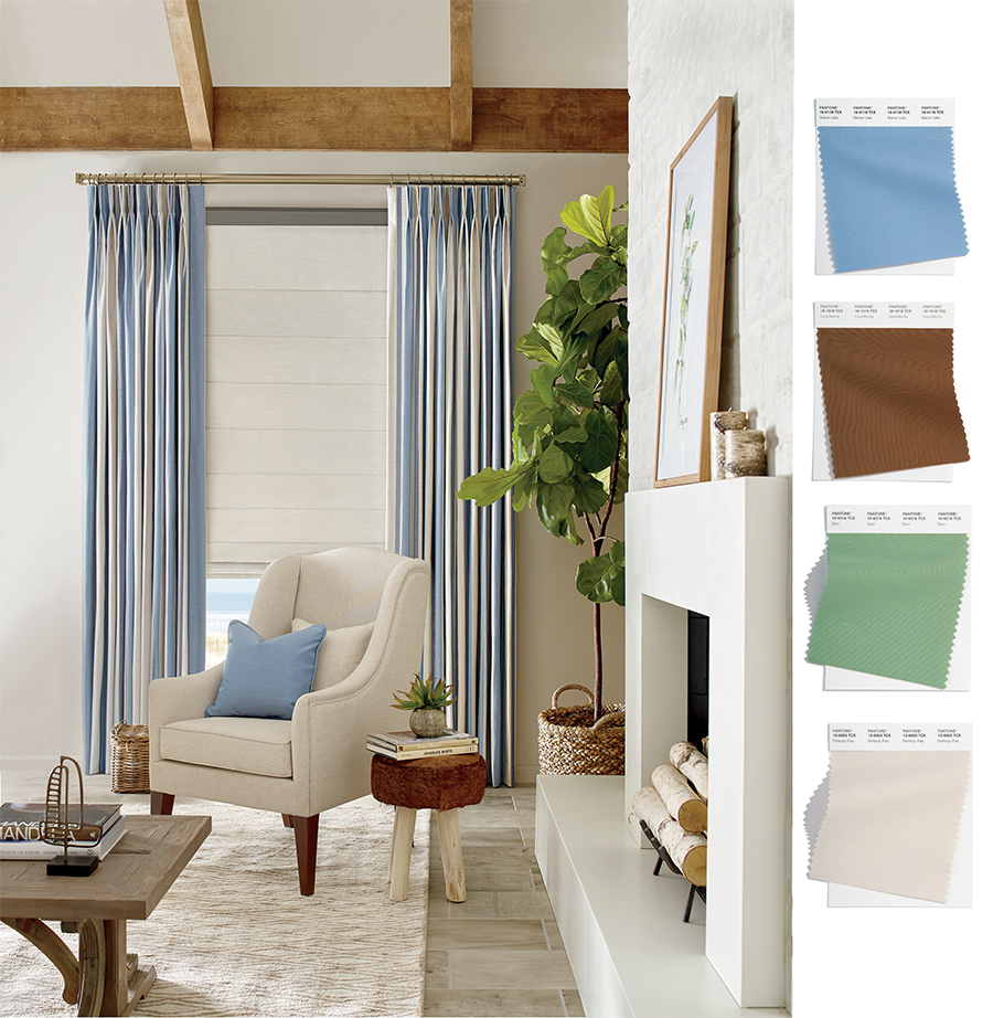
So far, each of the color combos have featured a brighter, more bold color. With this one, we’re bringing it back to a more tranquil and serene palette. If you lean toward loving more calming colors for your space, Glacier Blue and Basil are a great way you can still incorporate color while keeping it soft!
Don’t Shy Away from Darker Tones
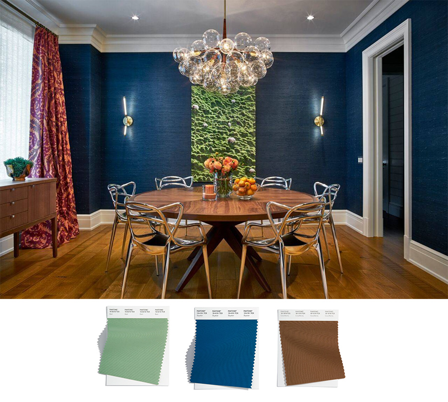
Have you imagined using a darker color in design? Jewel tone walls can invite an elegant, sophisticated vibe. And, while introducing deeper colors can seem a little daunting, at times, this rich blue, Skydiver, is a great example of why you shouldn’t shy away from those darker tones. It brings just the right amount of moodiness to a space and pairs so nicely with white trim and wood tones.
Which of the Upcoming Color Palette 2022 Color Stands Out to You?
Styling a space helps to emulate your personality and make you truly love looking around your home. These colors serve as a great guide to creating combinations that instill those feelings you want around your home. Whether you’re leaning more toward neutral shades or bright and bold tones, the upcoming color palette 2022 definitely delivered 15 amazing colors to choose from! Our team here at Skyline Window Coverings is here to help you complete those projects you’ve been wanting to tackle. Contact us today to get started with your FREE consultation.

